A Bit Lost: the making of…
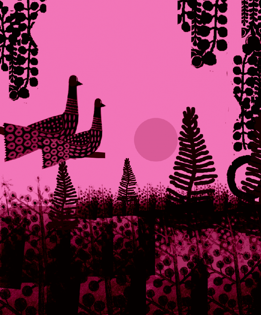
Before I had my idea for my little lost owl story I had actually wanted to do a different story about birds in a forest. The birds in the first story come down from their tree top roosts to the bottom of the forest and meet all the other animals of the forest along the way. They pass all the forest animals who want to eat them and eventually manage to find food near the forest floor. The last spread would then be a panoramic of them back perched at the top of the trees at the end of the day overlooking all of the life of the whole forest. I had the idea because I wanted to introduce all the animals and have the interactions of the forest in a sort of Arne Naess story of deep ecology and interconnectedness.
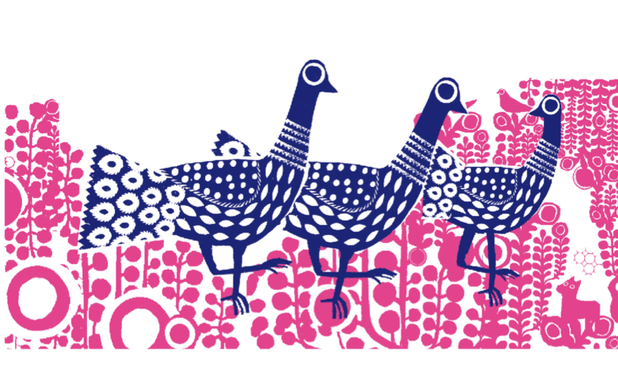
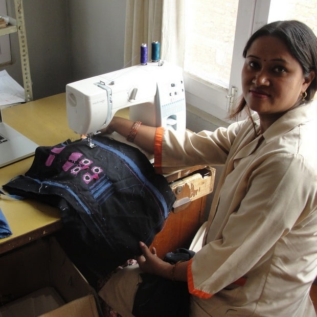
This image was the trigger for the story. It’s a screen print I did for the fair trade company People tree. I really liked the image because I had the idea of hiding figures in the complex background (see the little cat in the bottom right)
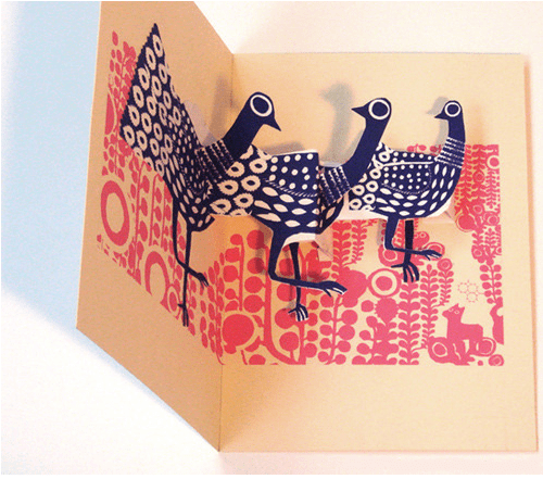
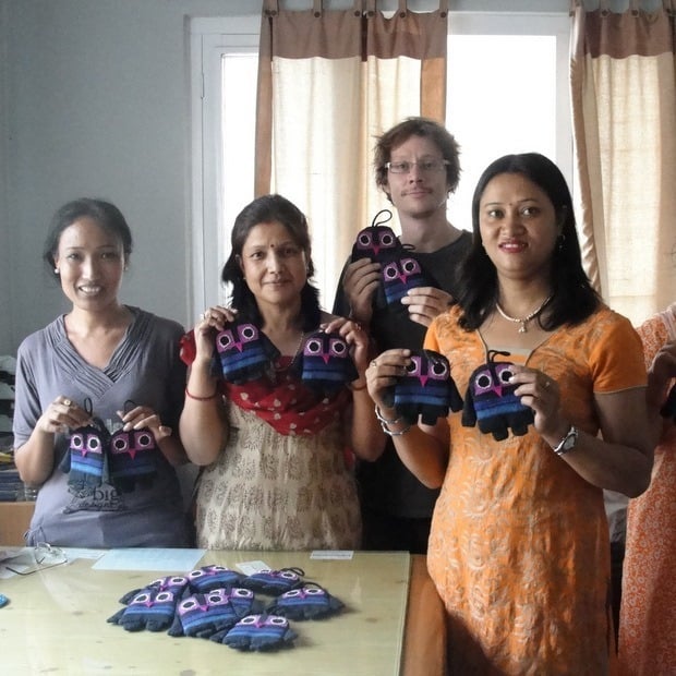
An early prototype of the pop-up for People Tree. You can see it animated here. They should be available to buy soon from people tree’s site actually.
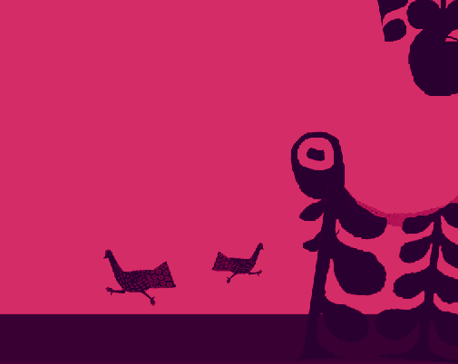
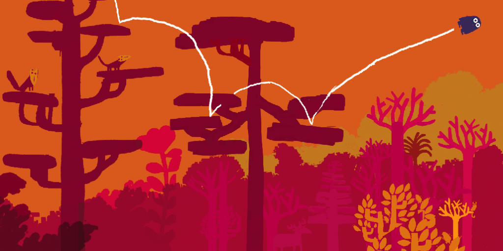
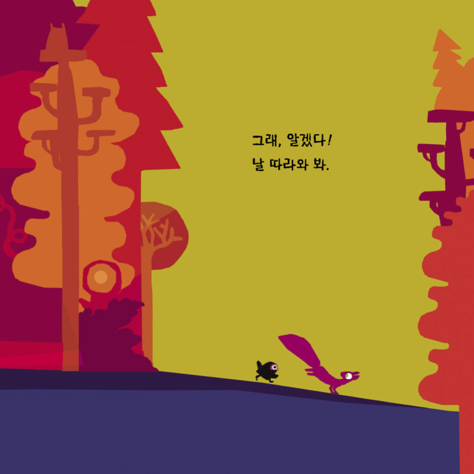
I liked the silhouetted running shapes of the birds. They eventually evolved into the running owl and squirrel in the finished book.
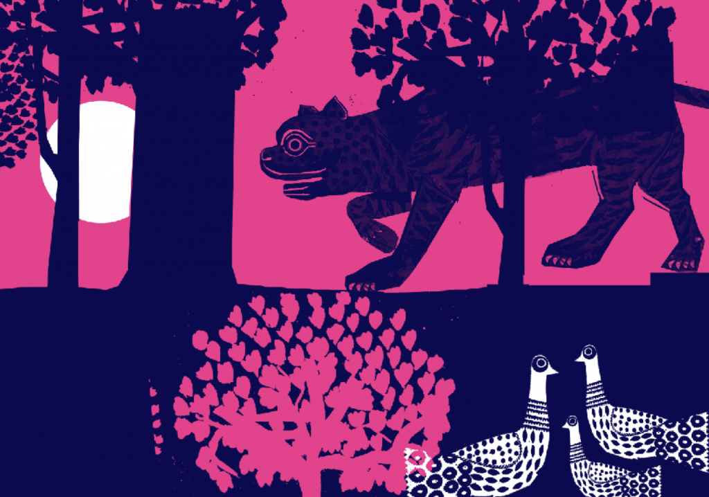
The birds here hide from a tiger (also a snake and an elephant)
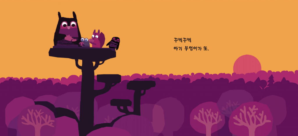
The birds in their perch for the final image. They look across at the whole forest and see the web of all the animals that we met in the story.
In the end I sort of had to scrap the idea, I didnt like the way the birds interacted with the other animals of the forest. They were not engaging with them as such and it left a sort of lonely tone to the story. I may try it again another time but for this book I decided I wanted to do something that was more engaging and somehow a little like pantomime. Without engaging with little funny questions and cause and effect (Uh oh! is he going to fall off?/ Uh oh! Is it Mummy? etc) a very young audience tends to lose interest quickly.
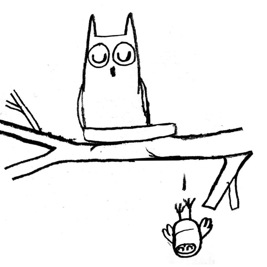
The breakthrough came when I made the bird fall from his nest. That way he was lost and had to engage with the other animals in a way that wasnt about avoiding being eaten. In order to give the bird a range of expressions, forward facing eyes is much better graphically so I chose an owl instead of a bird. Also owlets apparently have a habit of falling out of their nests. I had imagined somehow that owl babies were cute until i actually looked them up on the internet
In the end my story turned out very different. Although the story had changed, there were a few things that I kept the same. The main thing was for the story to be able to be read without words so that children can understand everything just by looking at it. I also wanted there to be other visual interests in the book that children can find themselves. In the first story there were glimpses of the berries that the birds were looking for all along throughout the story, and in the final lost owl story it is the mum looking for her child.
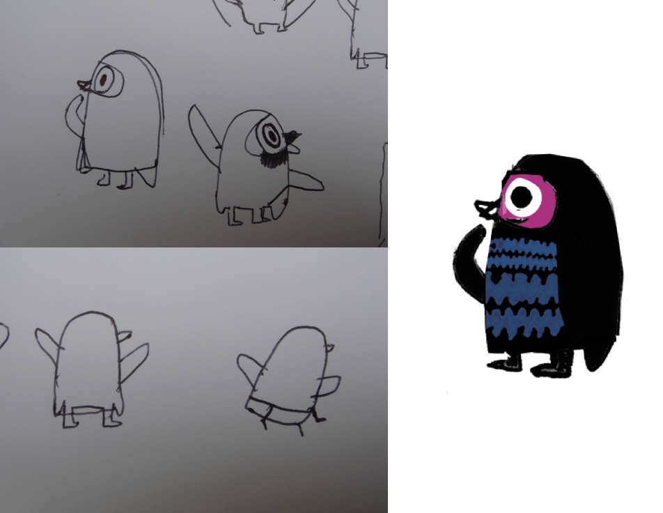
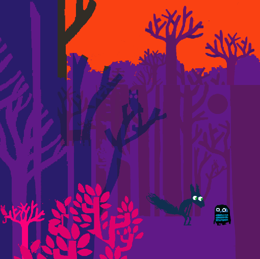
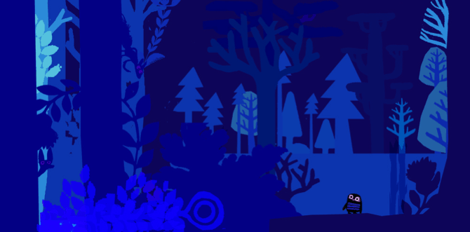
The first images of the new owl story
Although I changed the story, you can see the patterns on the owls were similar to the original birds and I was using all the same colours.
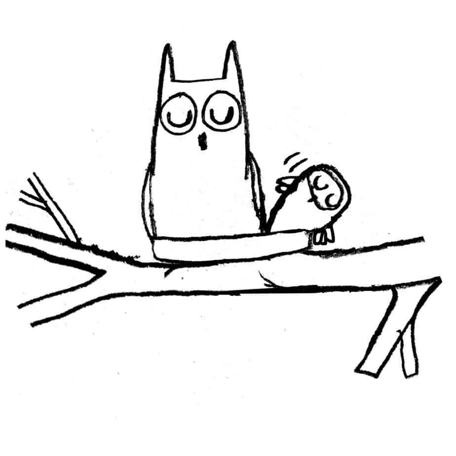
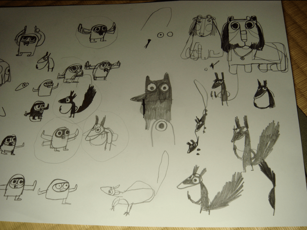
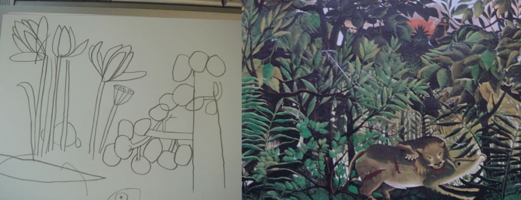
some character sketches
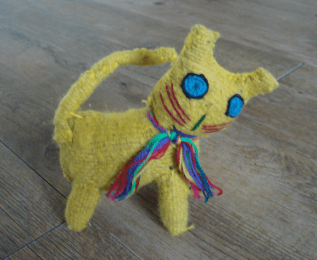
i got some character ideas from handicrafts i bought in Mexico (this one was made by Tejiendo Arcoiris in San Cristobal)
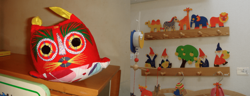
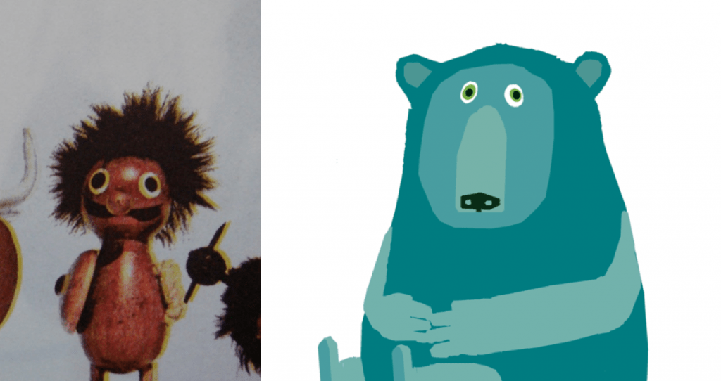
…more bold graphic toys for inspiration…
a noggin…
and a bit of henri rousseau.
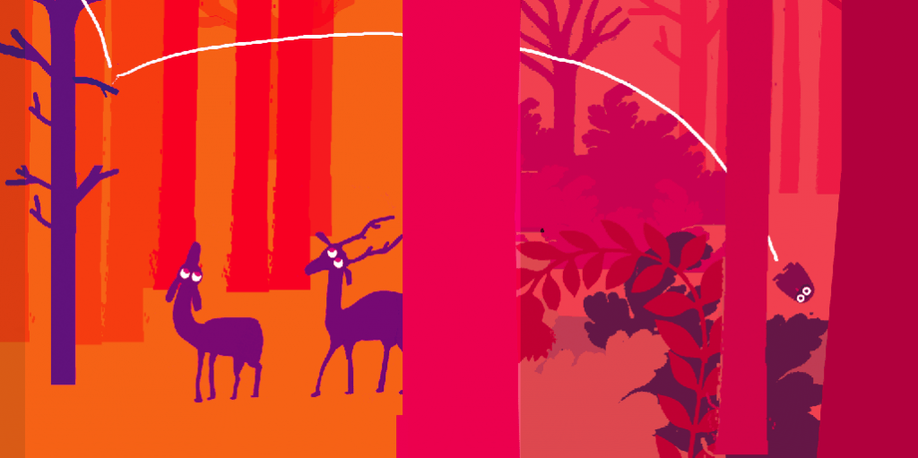
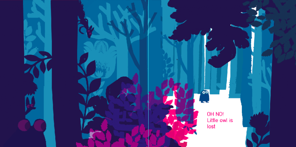
I had the idea of doing a leporello (non-accordian) fold-out so that you can follow the path that owl takes as he falls. I ended up dropping this idea too. But there is still a half page where little owl drops on the opening spread.
Eventually I lost most of the pink colour from the owls too. By now it has now become almost unrecognisable from the original story
some more colour tests…
i started going a bit mad with all the trees….
one thing i like about these is the only white on the page is the white of the eyes of the characters. It focuses attention on them in what would otherwise be a very busy image.
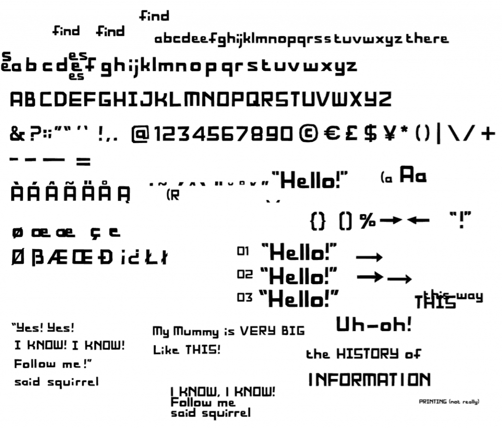
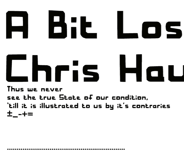
I did the typeface for the book with help from the brilliant typographer Andreas Pohancenik
a test for the endpapers
i quite like squirrel playing peek a boo in this early version of the cover.
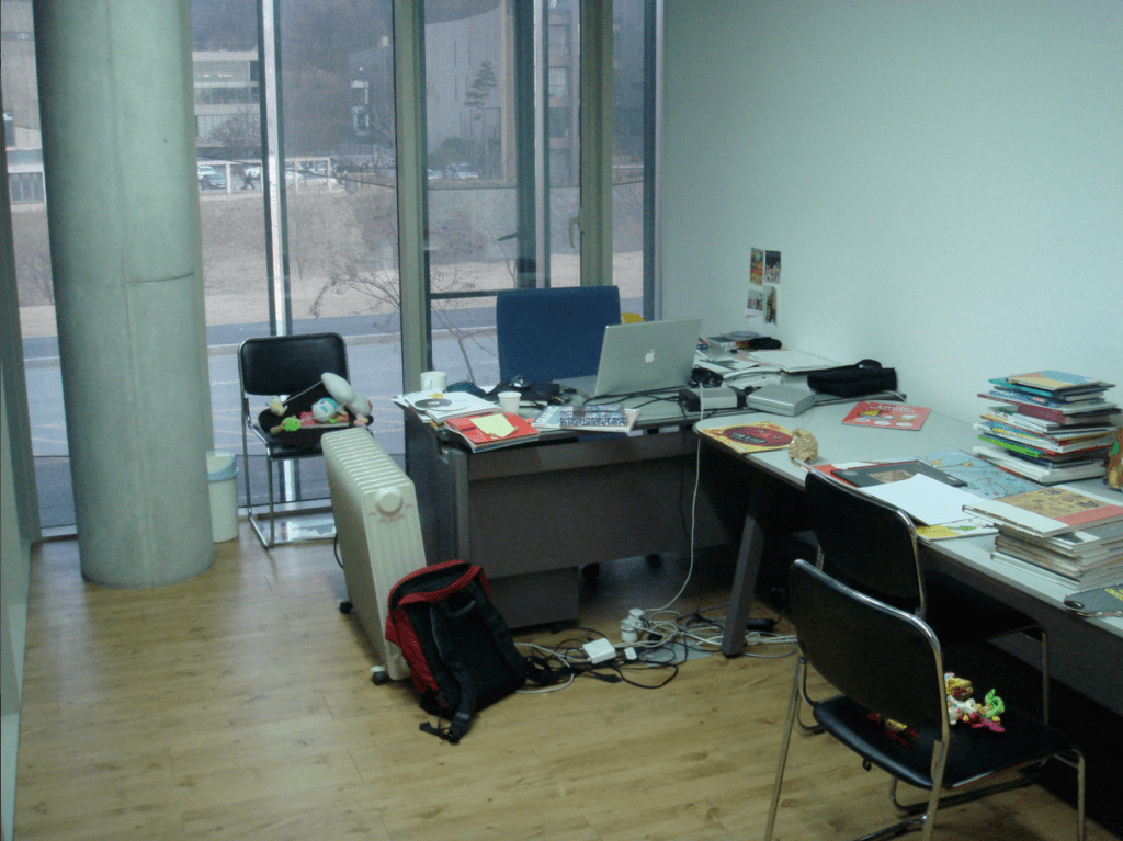
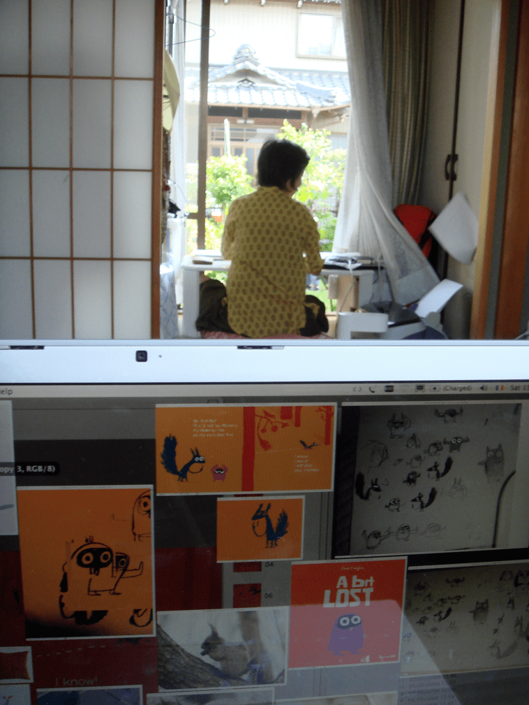
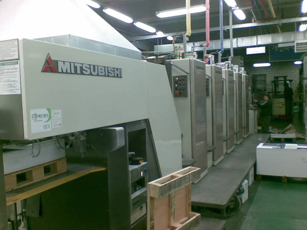
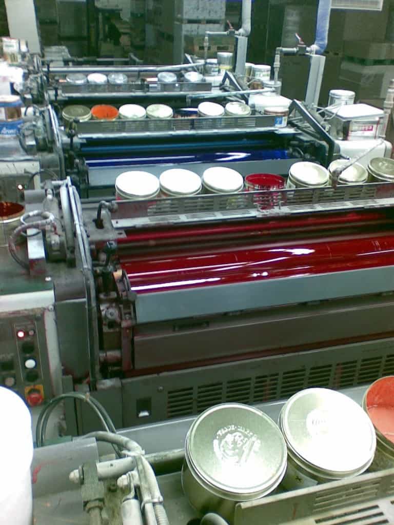
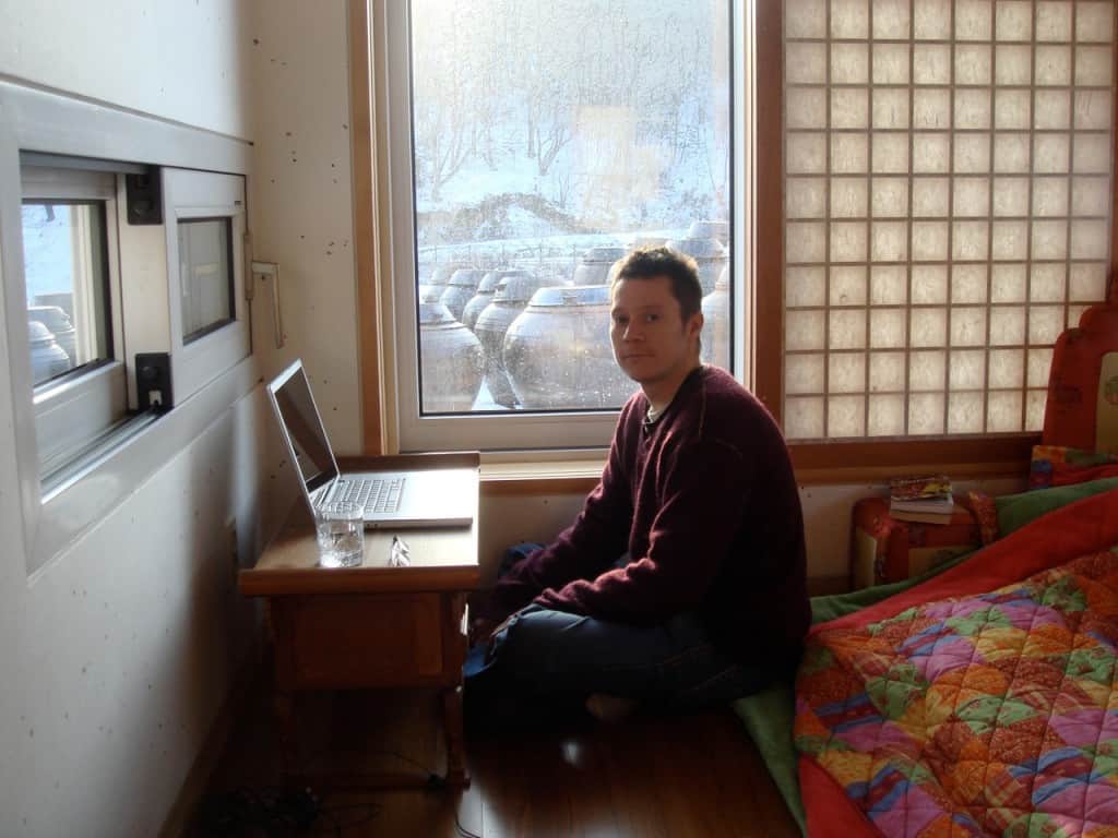
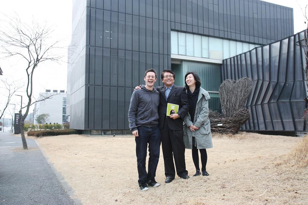
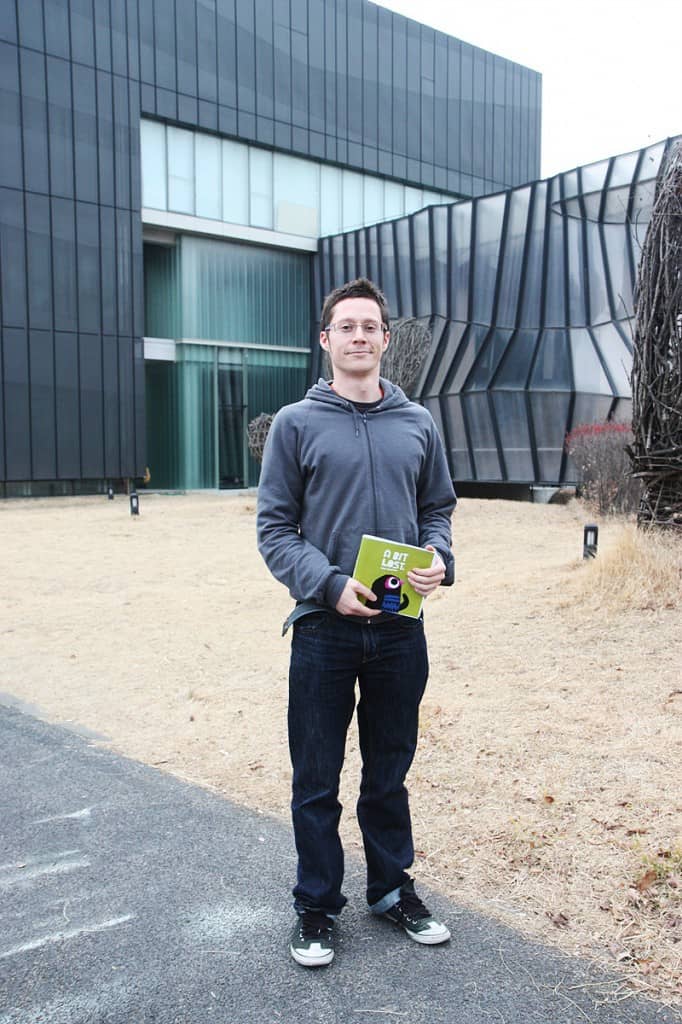
I did half of the book in Korea …it was published first by the AMAZING Borim Press. Check out the post I did about them here. Their set-up is very interesting.
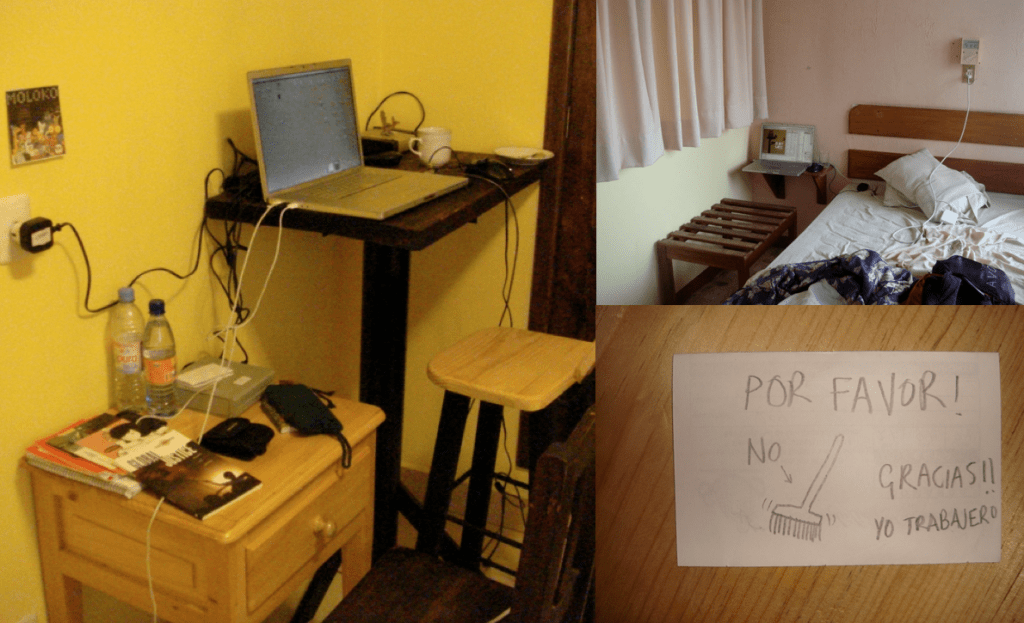
…and the other half in Mexico ..so i could concentrate fully on it. I had to stop working on other jobs so i was running out of money by now!
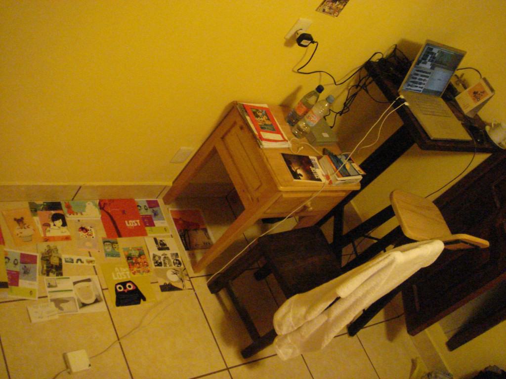
i had some reference images spread out on the hotel floor and was worried the were going to get tidied up.
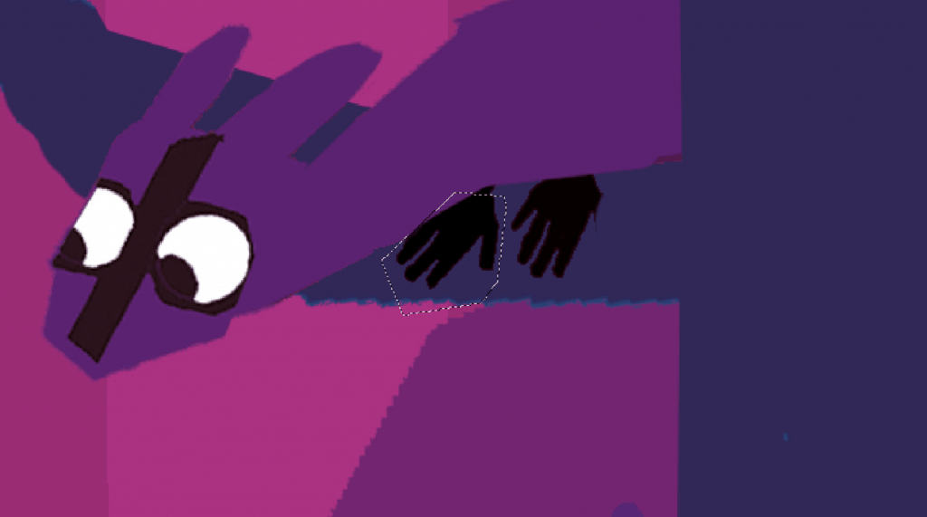
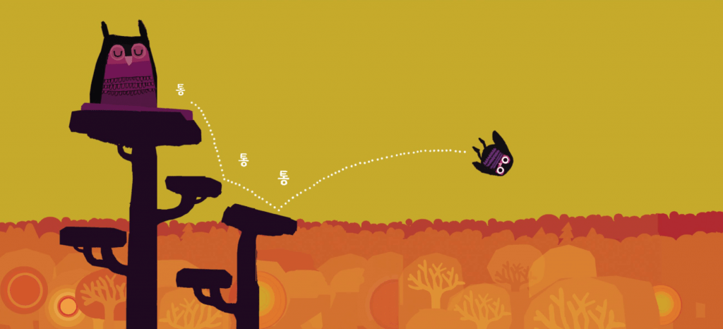
the final spread of the owl falling
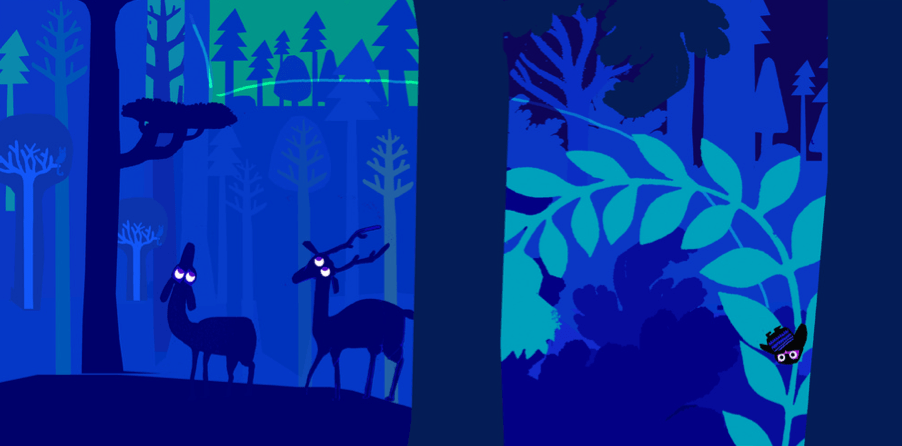
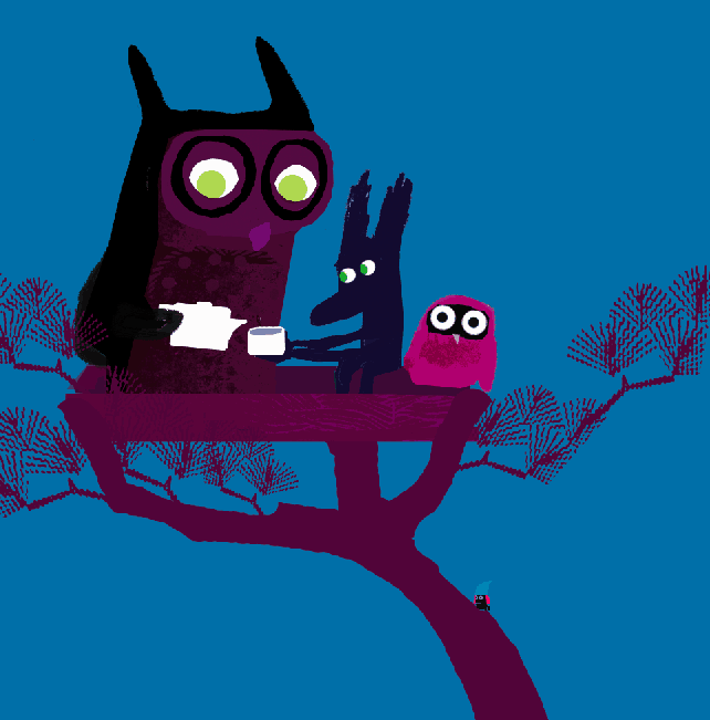
in the finished pages you can see the mother hidden in the top left as her child is running around looking for her. the silhouettes of the running animals were inspired by the earlier work with the running birds.
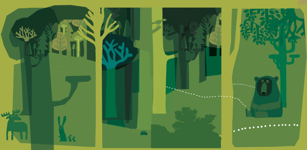
The panoramic final scene is also based on the imagery from the earlier story
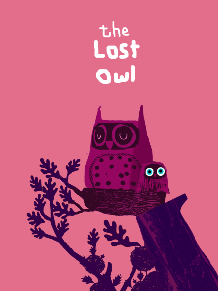
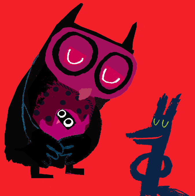
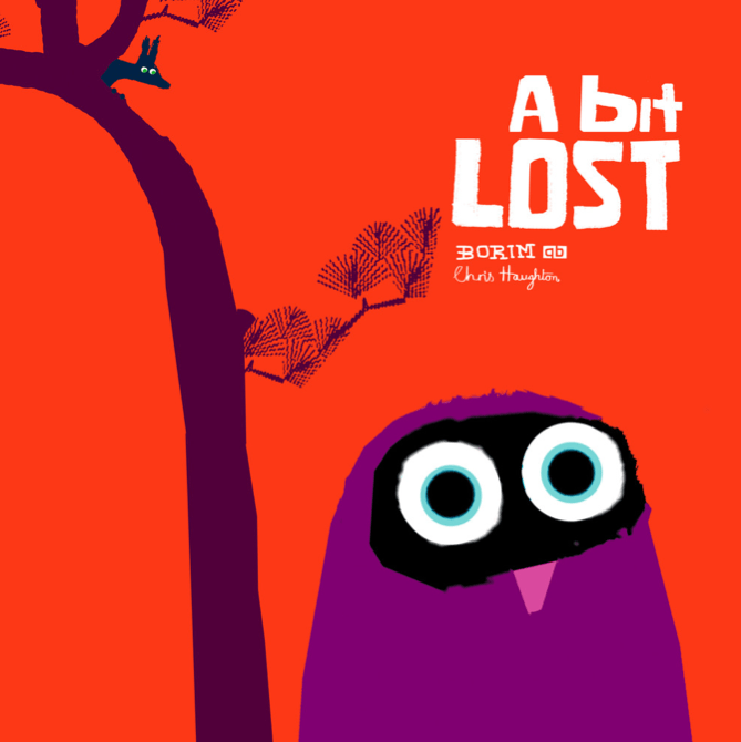
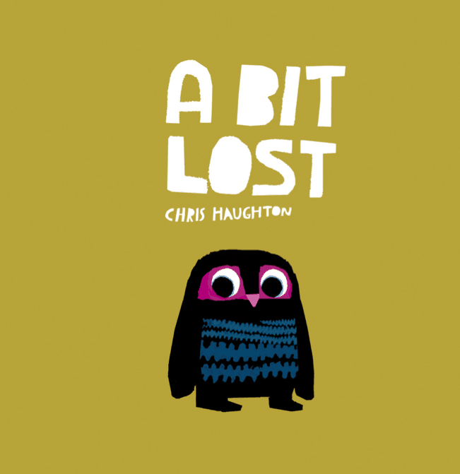
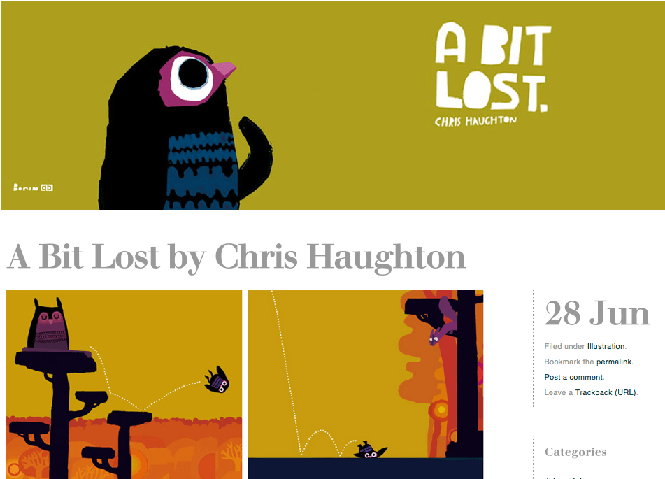
The final cover as it is now in English
If you want to see more you can see the first few pages of the book HERE
