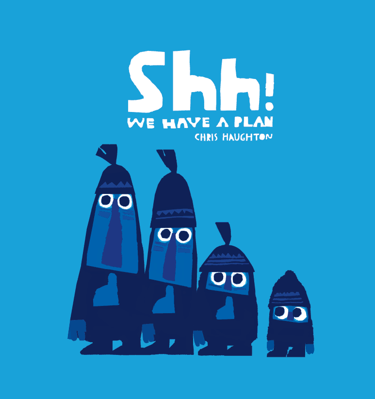
One of the things i have been trying with my books is to tell stories as much as possible through images rather than through words. If the story can be read without language, it should have the ability to be understood by the very young. I would like to think all my books are told in a way that someone without language could understand but I think the story in this book could be the most visual of the three, it certainly has the least text. In fact, the total word count is only 103, and ten of those words are ‘shh!’ which I am not sure is a word but I counted it anyway, I even counted the five words of the title which is a trick i picked up at school. It is a bit embarrassing then, that it took more than 2 years to write. I worked out on average I wrote one word every six days. Not exactly the writing speed most writers aim for… anyhow…
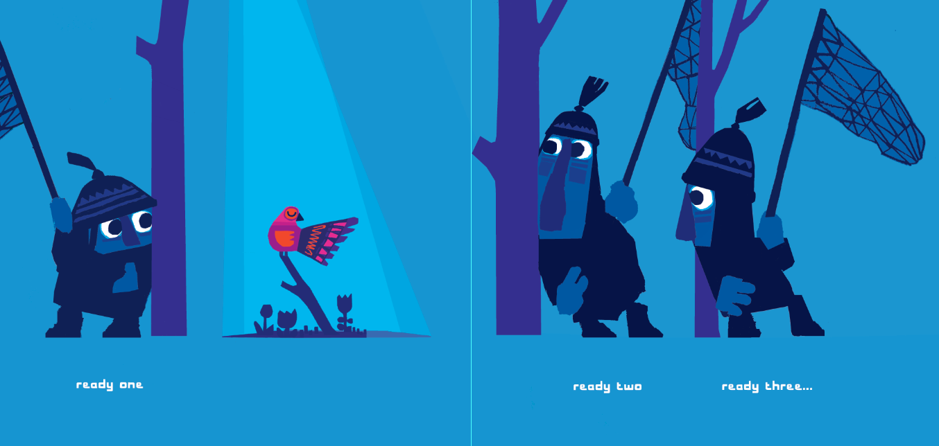
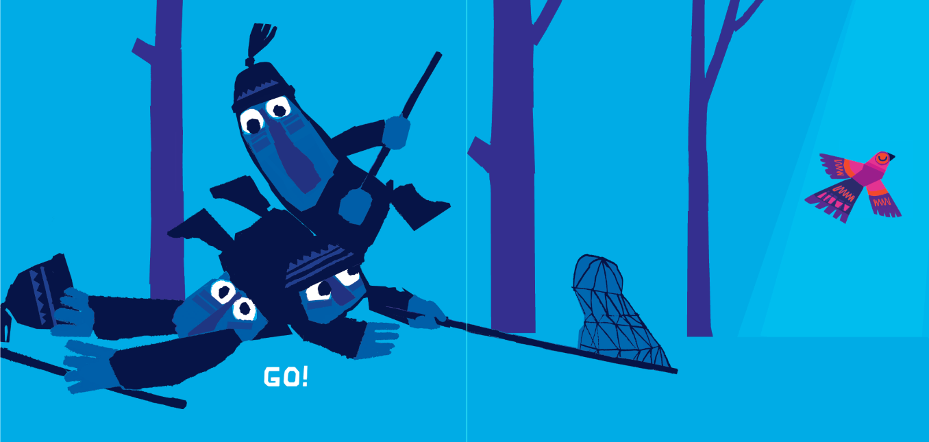
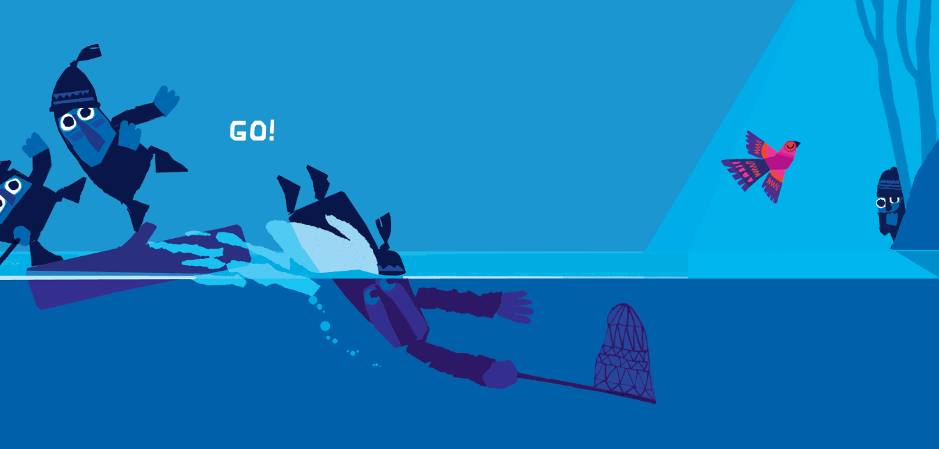
I started sketching out ideas for this book thinking there must be some way of making a ‘chase/catch’ type book. It was sparked by seeing an incredibly inspiring show at the Edinburgh fringe by Mr. Bunk called Swamp Juice. It brought me around to thinking of the Road Runner cartoons where there there are elaborate plans which could all work very well visually. Quite suddenly three goon type characters trying to trap a bird popped into my head, that it would be great if there were three, each with a different plan. What I liked the best was there could be a drawn out pantomime effect, similar to A BIT LOST and GEORGE, with an anticipatory page turn between ‘ready/steady’ where the three position themselves to catch the bird and GO! ..where of course they miss.
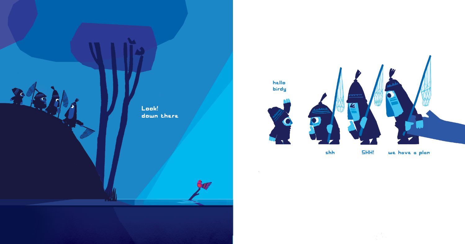
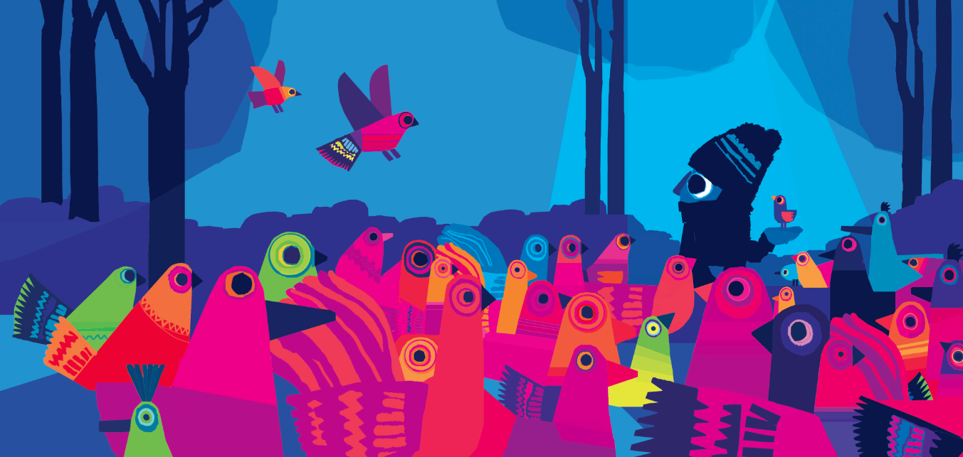
Finding the ending was easy as i had sort of come up with it in the beginning (!) the really tricky part was fitting the ending into the story. I originally had three other ‘good’ characters who were feeding the birds instead but it seemed very abrupt to introduce them midway. It seemed best to have a character with the answer the whole way through. The book seemed a little clunky and wordy when mocked up with four/five characters on every page, so together with my art director, Deirdre, we hit on the idea of a conversation happening across a page. There was lots of comic potential with this, i really loved working on it. If you think of books like Martin Waddel’s ‘Owl Babies’ it makes use of a repeated conversation across the page, each character repeats the same thing, over and over again. It is predictable but also has a pantomime effect and great for doing silly voices. We had so many great lines we had to work on editing it down and in fact I think there is enough material for another picture book in there if we are lucky.
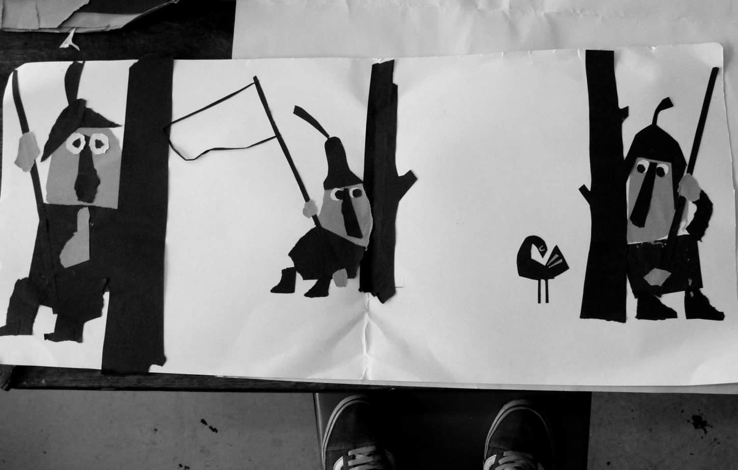
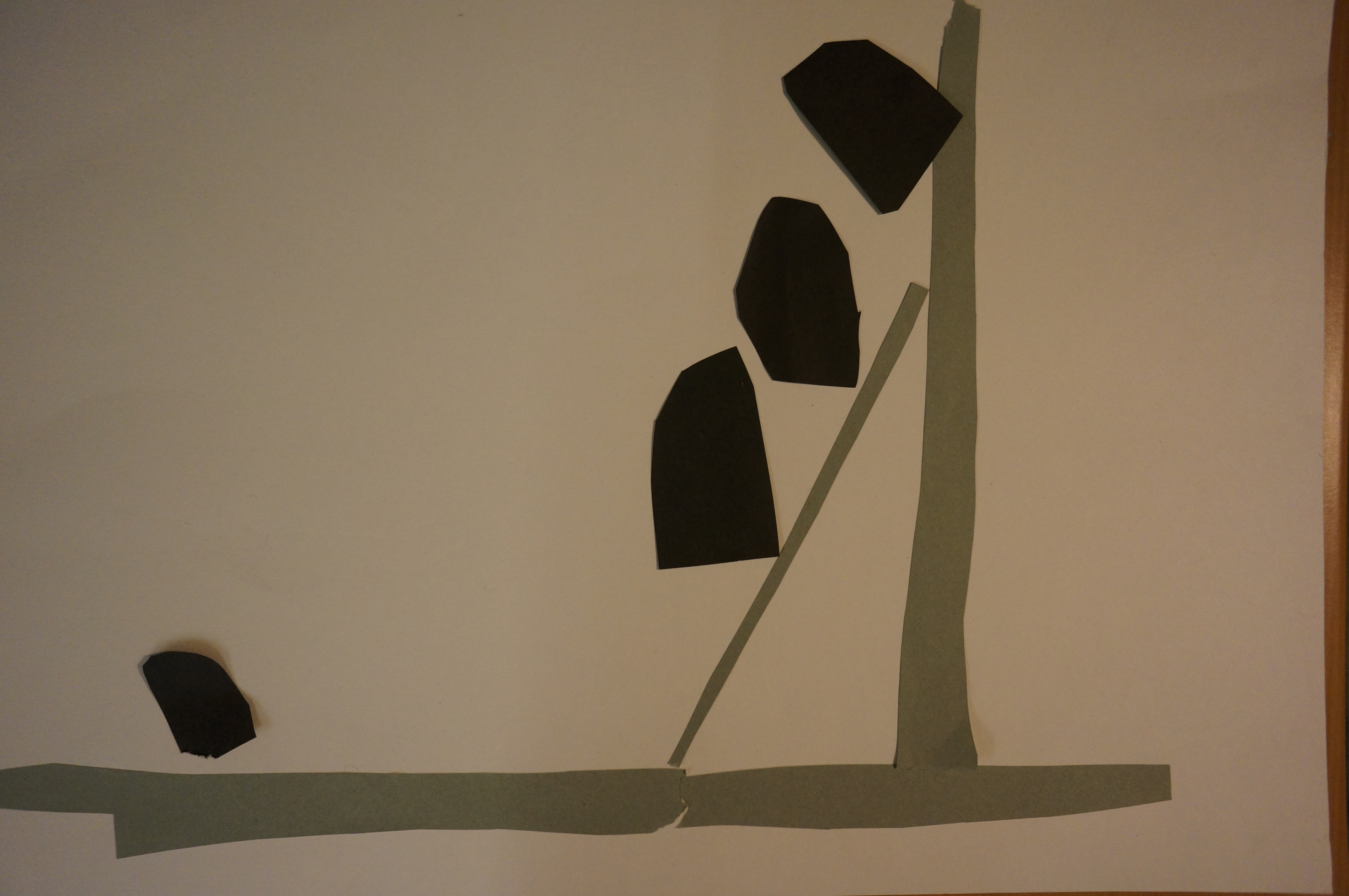
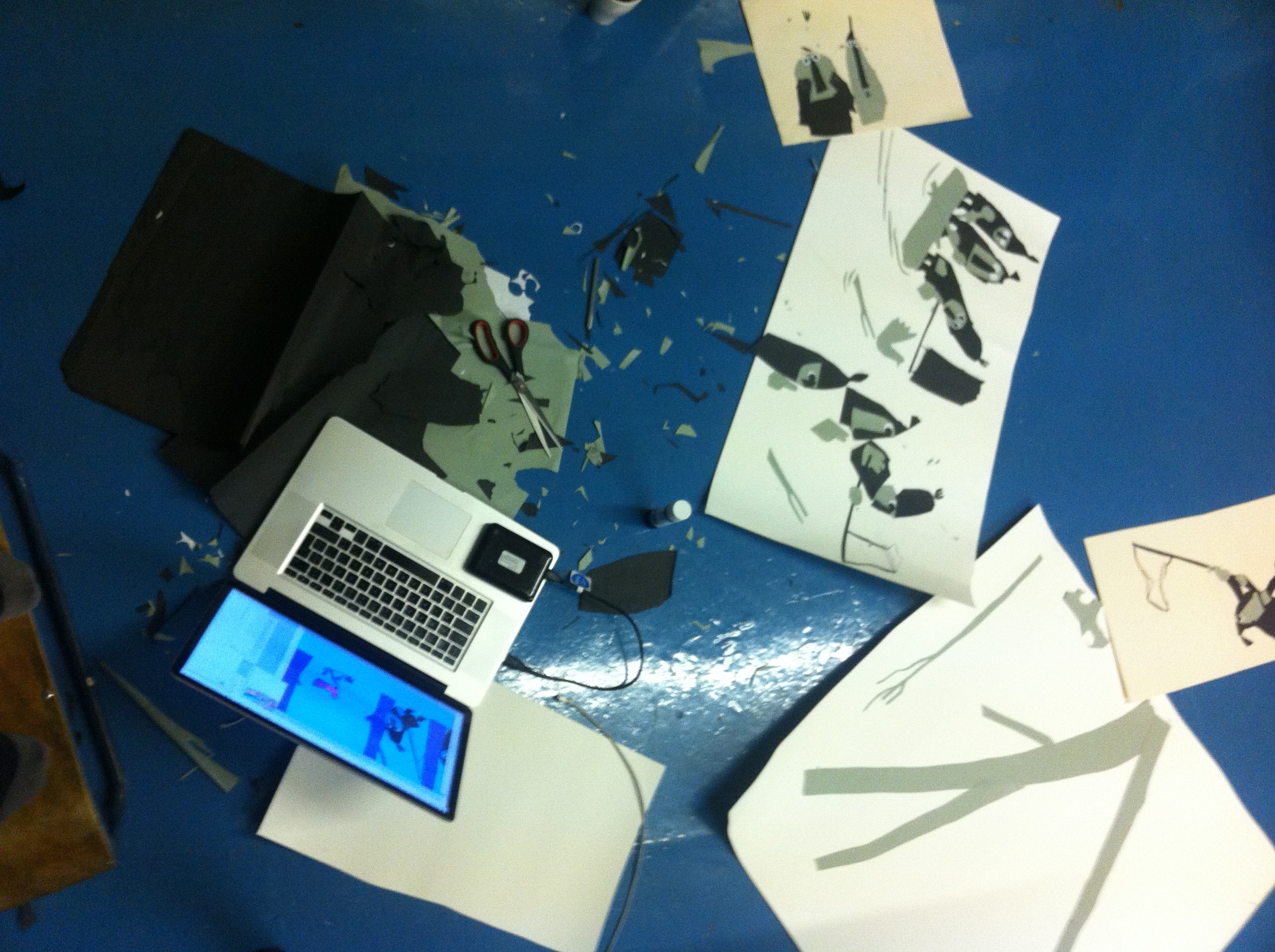
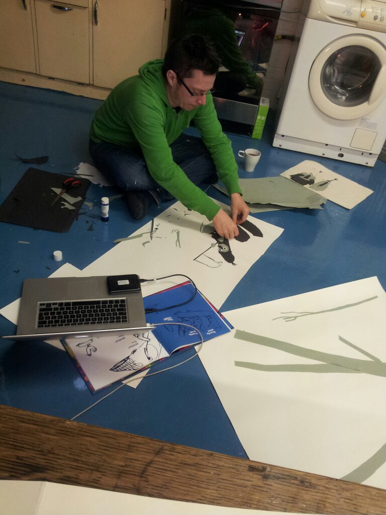
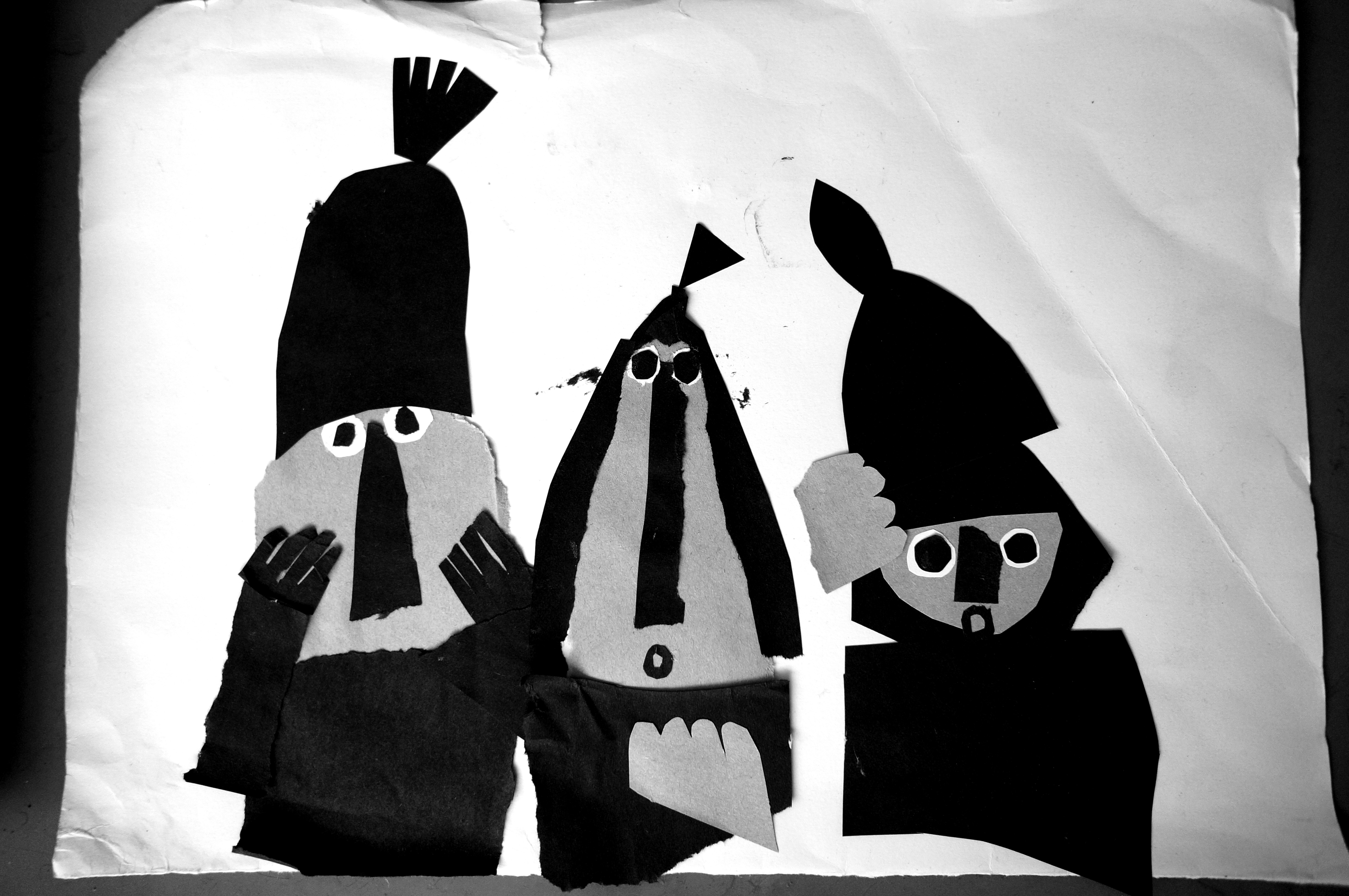
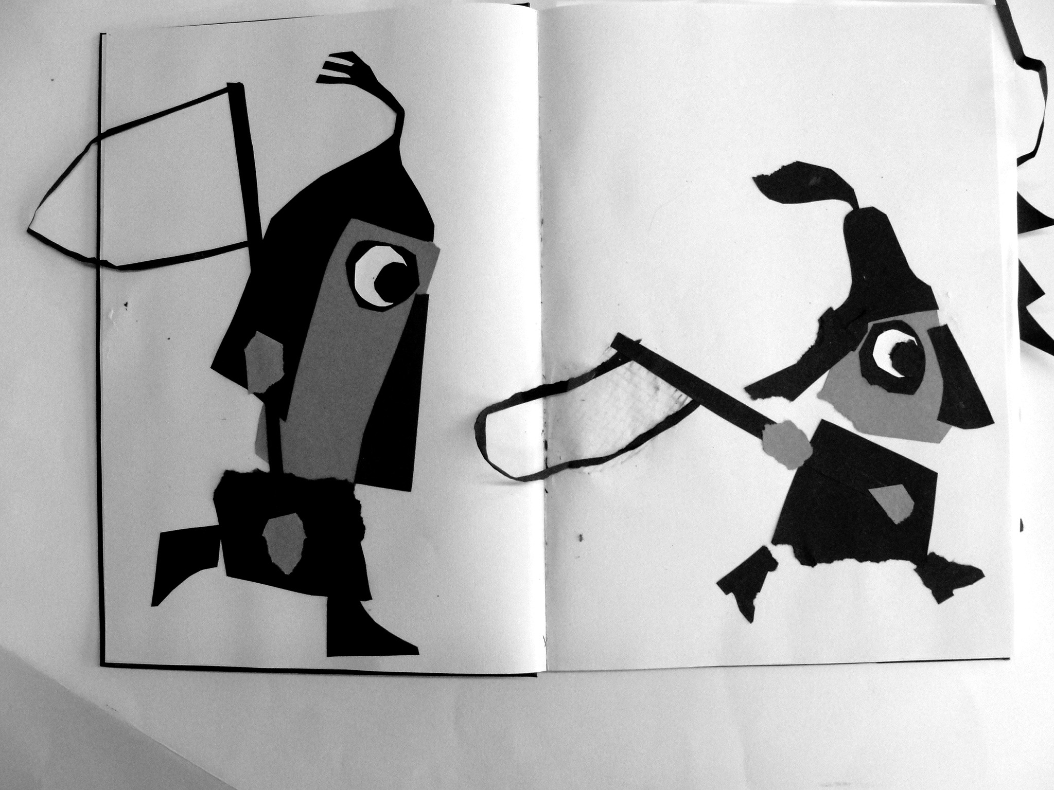
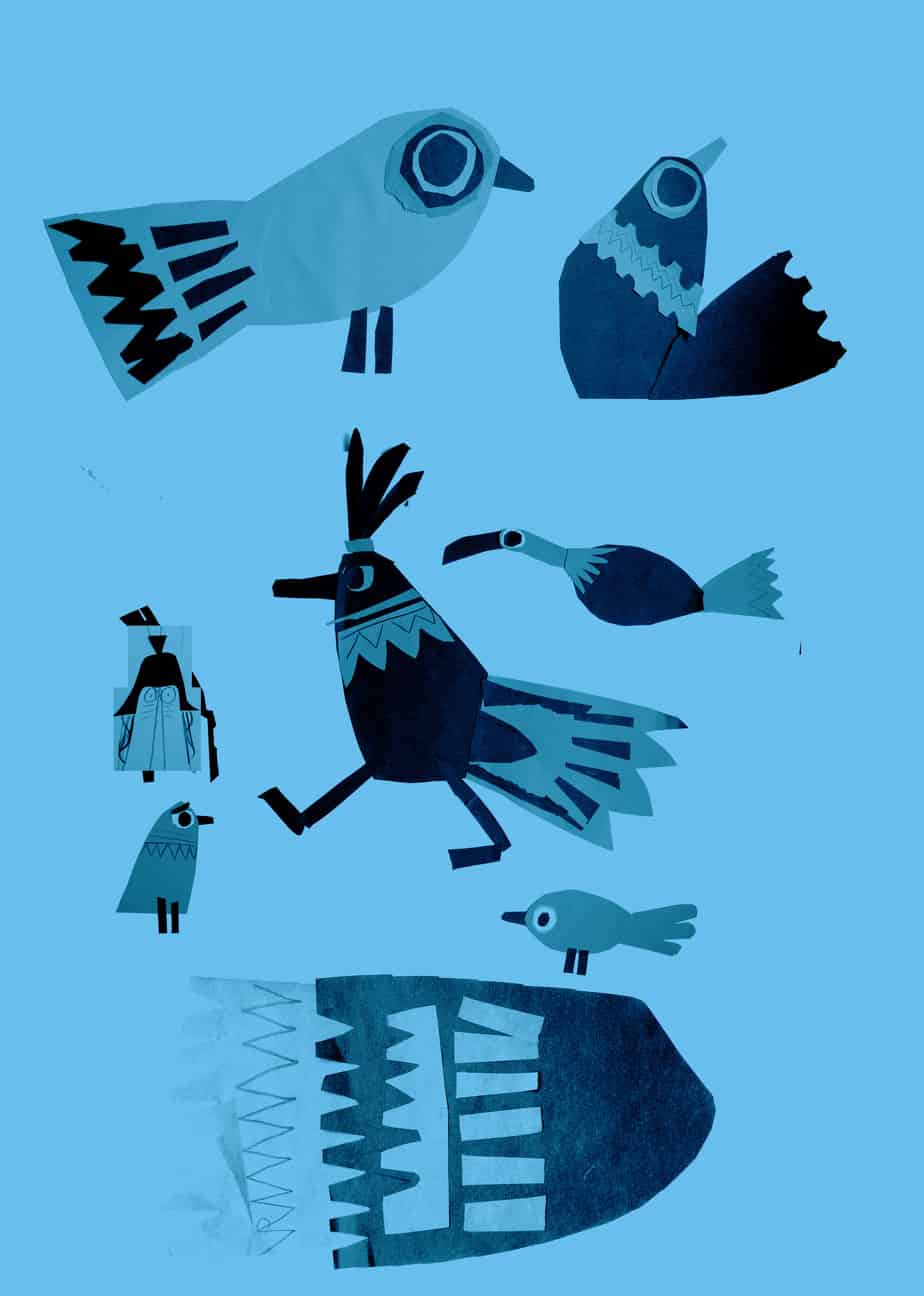
For my other two books, i am always asked if i used paper cut, as they look quite like it, but in fact I did not use paper cut at all when creating the artwork and it was all pencil and digital. For this one though because it had five characters on each page it needed some sort of drastic simplification for it to be read clearly. Not only that but I was keen for the conversations to read across the page, matching each line with the action of the character. There was so much shifting of compositions around on the pages that it became clear the best way to compose each page was by collage. In fact it made perfect sense to create a mainly silhouette image from paper cut and in fact the design of the birds also benefitted from it too.

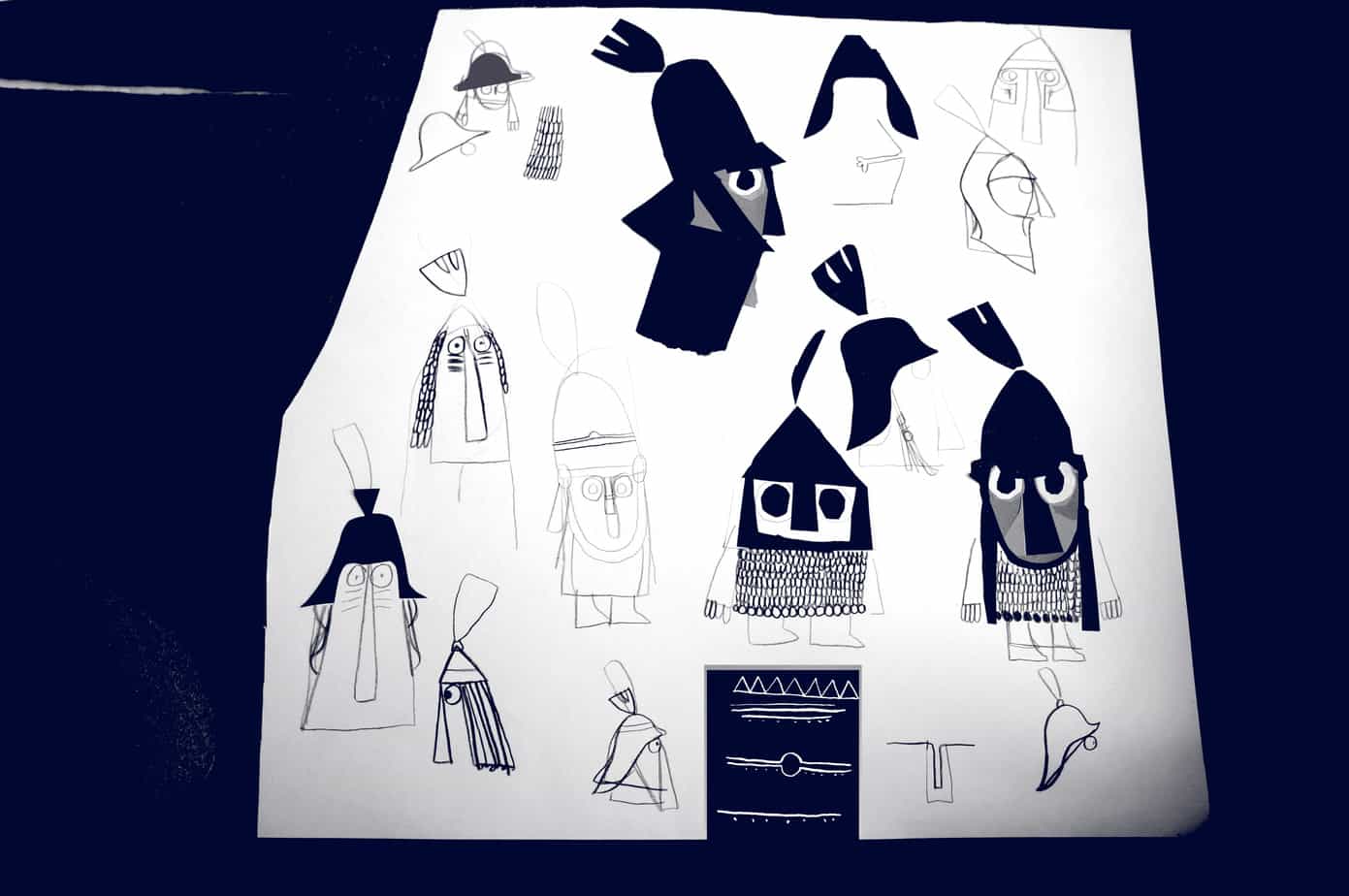
some character sketches
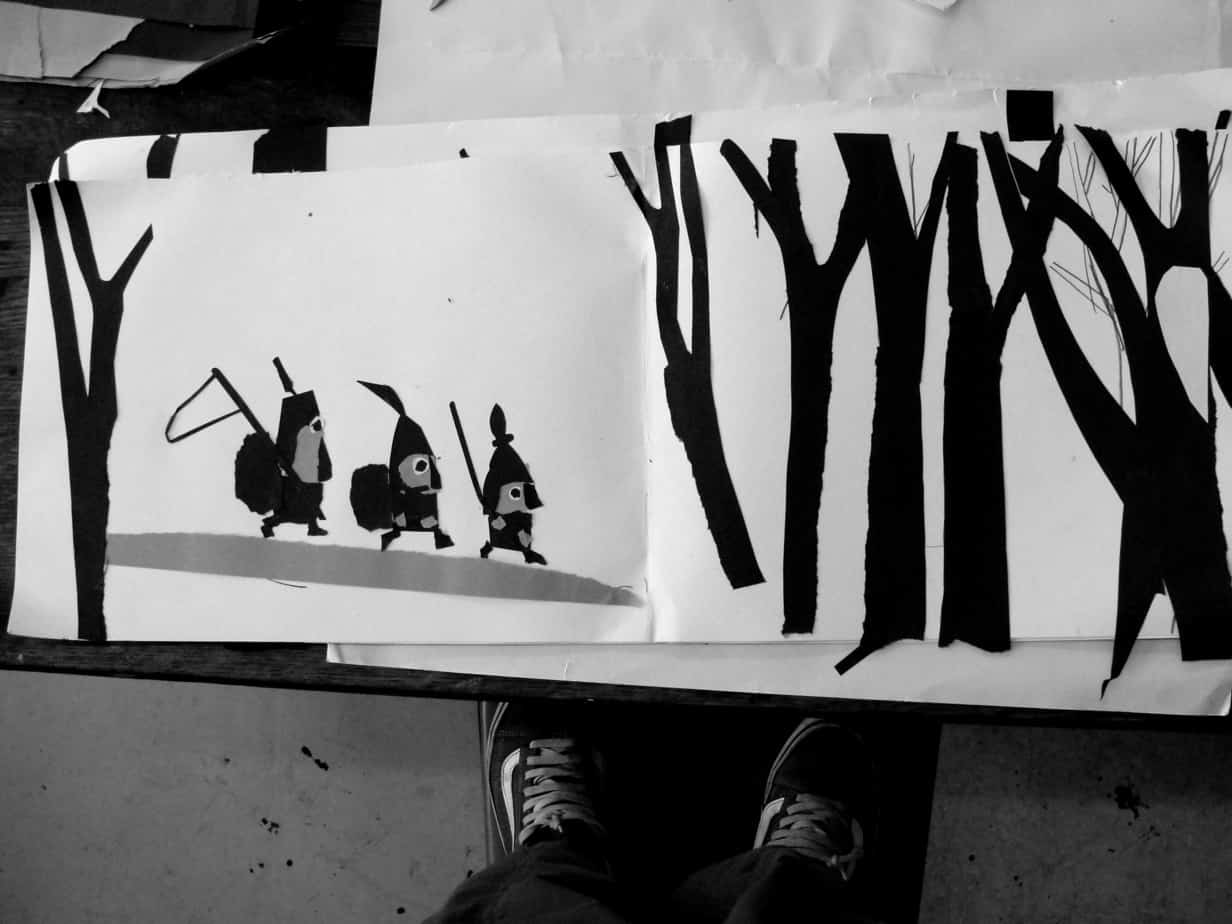
some pages showing papercut to digital.
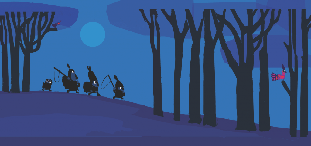
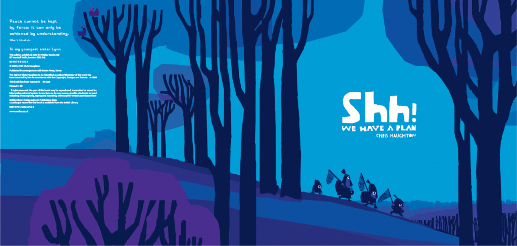
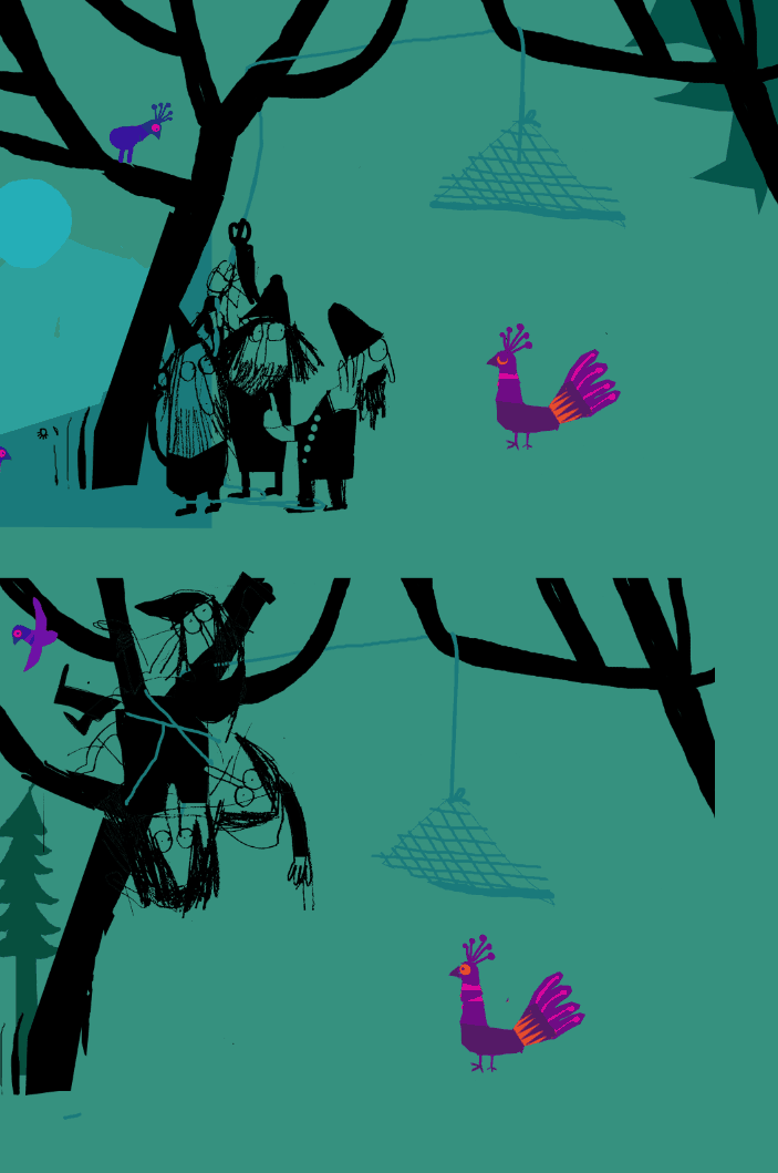
For the final artwork i was keen that that the bird seems somehow from another world, brightly coloured and abstracted and removed from the world of the characters, it focuses all our attention on the relatively tiny bird on the page, leads the reader through the pages of the book and gives a punch of colour at the end. My other books are very colourful so it was quite satisfying to try to work almost entirely in silhouette for this one. In fact there was a lot of really interesting experiments with the colour. Usually full colour printing is in CMYK, but the whole of the book is printed in only CMK (blue,magenta,black) and the only yellow that appears in the book at all is in the colour of the birds. It was our hope that with this approach the bird would stand out completely from the rest of the book.


I am hugely indebted to my art director and editors, Deirdre McDermott and David Lloyd at Walker books ( i posted about them here) for all their feedback and help on this book. It improved immeasurably with their help and I consider myself very lucky to be working with them.
Available here:
ENGLISH Shh! We have a plan
SPANISH Shhh! Tenemos un plan
CATALAN Shhh! Tenim un pla
NORWAY Shh! Vi har en plan
DENMARK Ssh! Vi har en plan
NETHERLANDS Ssst! We hebben een plan
FRANCE Chut! On a un plan
I will be doing a SHH! book tour in UK/IRE/France in March/April
Wow. It’s very refreshing and enlightening to be able to see through a window onto your creative process. This book looks at least as amazing as the other two, which are the best modern storybooks we’ve found. You seem to have taken a leap forward even!
Thank you so much for taking the time to post this. As a father of 5 and a Creative Director (who has illusions he can illustrate and write), it couldn’t be more inspirational.
Pure joy, I am so glad you’re doing this job 🙂
D
My 2 year old and I have been willing you to make a new book. We are VERY EXCITED. Oh No, George! and A Bit Lost are our favourite favourite books.
[…] at Chris Haughton’s work process. Fascinating. I’ve been thinking about Wawrinka’s tattoo and how it’s affected him… […]
thanks so much for the lovely comments and I hope you enjoy the book when it comes out. very best wishes!!
Mr Haughton, your picture books are simply amazing. I had the chance to listen to a nice french bookstore attendant read Chut! On a un plan before it reaches french Canadian bookstores. This papercut technique is very “rich” and from what I have seen from the video the colors are beautiful. ANd the scenario! Wow! Easy to predict that this book will also earn many prizes, but most importantly, children will love it!!! Bravo de Montreal 🙂
[…] gives a detailed description of his ideas for the book over on his blog here. I like the way that he shows his workings, sketches and thought progressions there too. Early […]
[…] Shh we have a plan […]
[…] and illustrator of Oh No, George! and Little Owl Lost brings us another comical and thoughtful story. The bold and unusual colour palette is appealing and the use of utterly delightful repetitive […]
[…] more information about the book visit Chris’s website. He shares a lovely anecdote about the concept of the book and the evolution of the book from his […]
[…] https://blog.chrishaughton.com/the-making-of-shh-we-have-a-plan/ […]
[…] first three books, Oh No, George!, A Bit Lost and the award-winning Shh! We Have a Plan. He explains in this blog how, with the latter title, it took him two years to write a book with just 103 words and part of […]
Shh, We have a plan
An incredible book, much loved by my own children and, in a recent lesson observation for a job interview, by all the children in a Year 2 class. I was able to use the hook line for a behaviour management tool, the setting to develop a whole class soundscape and the bulk of the book for ethical comprehension investigation. The children enjoyed exploring the book with me; it was a vital teaching and learning tool, and a genuine whole class ‘reading for pleasure’ moment. Needless to say this book secured me the job too!
Thanks Chris 🙂